Lean Six Sigma Green Belt Certification Scatter Plots
The scatter plots diagram is a simple representation method that is widely used in statistics to find the correlation between two variables. Analyzing scatter plot worksheet is slightly delicate to understand and needs some concentration to understand in depth.
Scatter plots are one of the important Lean and Six Sigma topics and need to be understood correctly in order to apply them in real-time applications. This article will scatter plots in-depth so that you can score high marks on the scatter plot topic in the exam.

How Scatter PLot is different from other tools in Lean Six Sigma?
People often ask for the use of Scatter plots, Pareto charts, Control charts, and Histograms in Lean Six Sigma. Scatter plots help identify relationships and patterns between two variables, aiding in understanding the cause-and-effect dynamics within a process. Pareto charts, on the other hand, highlight the most significant factors contributing to a problem by prioritizing them in descending order. Control charts are used to monitor process performance over time, enabling practitioners to identify variations and take timely corrective actions. Histograms provide a visual representation of data distribution, helping identify potential bottlenecks or opportunities for improvement. These graphical tools serve as invaluable aids in Lean Six Sigma projects, allowing professionals to make data-driven decisions and drive process enhancements with precision.
Scatter Plots – How to solve & tips

There are a total of 12 tips to complete scatter plots correctly. These tips were created by our experts who have over 30 years of experience. Read the given points carefully to understand scatter analysis completely
- If input measures are represented as X factors and outputs as Y, then scatter plots are used when both X and Y factors are continuous data.
- A scatter plot is a type of chart that is normally used for observations of relationships between two different continuous variables as well as to visually display the relationship between those variables. The values of the variables in the scatter plot diagram are represented by small size dots and the positioning of the small dots on the vertical and horizontal axis is used to determine the value of the respective data point, hence scatter plots use the Cartesian coordinates system to display the values of those particular variables in a data set.
- The study of such a graphical representation involving two variables and using such a diagram is known as a scatter plot diagram. Scatter plots are also known as scatter-grams, scatter graphs, scatter charts and correlation charts.
- There are some common challenges that arise with the use of scatter plot diagrams, like the scatter plot interpretation of causation as correlation and over-plotting.
- The most important thing to remember in correlation is that it doesn’t mean that the changes observed in one variable are responsible for the changes observed in another variable. Over-plotting exists when too many data points have been plotted. This results in the different data points overlapping, making it more challenging to identify the relationship between variables.
- The scatter plot diagram is classified in different ways, the most popular classification is based on correlation and it is extensively used in project management. According to the correlation, analyzing scatter plot worksheet are divided into three categories-
- Positive Correlation
- Negative Correlation
- No Correlation
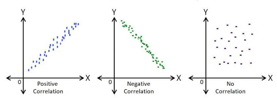
- Positive Correlation: This scatter plot is called a “Scatter Diagram with Positive Slant.” In this case, the value of X increases with the value of Y. If you draw a straight line along the data points plotted on a graph, the slope of the line will go up, which concludes that the correlation between these two variables is a positive correlation.
- Negative Correlation: In this type of correlation, the value of X increases as the value of Y decreases. This type of scatter plot is also known as a “Scatter Diagram with a Negative Slant.” If you draw a straight line along the data points plotted on a graph, the slope of the line will go down, concluding that the correlation between these two variables is a negative correlation.
- No Correlation: In this type, the data point spreads randomly in such a way that you can’t draw any line through the data points and it concludes that these two variables have no correlation or zero degrees of correlation. These types of scatter plots are known as “Scatter Diagram with Zero Degree of Correlation.”
- To construct a scatter plot- record the data in a tabular form. The table should have both the variables with their respective values and data range. Once the data is collected, draw the graph showing the independent variable on the x-axis and the dependent variable on the y axis. Mark a dot on the graph where the values of both the variable data intersect. Observe the pattern, if there is any. If the dots form any obvious line or a curve, the variables are correlated.
- The scatter plots can be used when you have paired numerical data. It can also be used to determine if your dependent variables have multiple values for each value of your independent variable. Scatter plots can be used to determine whether the two variables are related or not, to identify potential root causes of problems, after brainstorming causes and effects using a fishbone diagram, to determine objectively whether a particular cause and effect are related or not and to determine whether two effects that appear to be related both occur with the same cause.
- Along with this scatter plots are used in many sectors such as in Lean management to determine root cause analysis, in Economics to illustrate relationships between two economic phenomena, such as employment and output, in Management to visualise how product inventories affect costs or delivery times, in Market Research to illustrate, for example, the relationship between advertising methods and sales.
- Scatter plots help visualise the relationship between two variables, show a non-linear pattern, establish a relationship between two sets of numerical data, provide the data to confirm a hypothesis that two variables are related, track patterns and trends of different measures, and determine the range of data flow, for e.g. the maximum and minimum values.
How to interpret Scatter plot with regression line?
Scatter plots with regression lines are powerful visual tools that allow us to gain valuable insights from data. Understanding how to interpret these plots can unlock a wealth of information and help us make informed decisions. A scatter plot displays the relationship between two variables, where each data point is represented by a dot on the graph. The regression line is a straight line that represents the overall trend or pattern in the data. By examining the slope, intercept, and dispersion of the regression line, we can assess the strength and direction of the relationship between the variables. A positive slope indicates a positive correlation, while a negative slope signifies a negative correlation. The scatter plot interpretation with regression line enables us to identify outliers, clusters, or any non-linear patterns that may exist in the data. By mastering how to interpret scatter plot with regression lines, we can extract valuable insights and make more accurate predictions from our data.
Let us go through some scatter plot analysis examples for a better understanding of how it is used in projects.
Lean Six Sigma Green Belt Certification Scatter Plots example 1
To establish a relationship between two continuous data we use?
Lean Six Sigma Green Belt Certification Scatter Plots example 2
When we perform a Linear Correlation Analysis and finds that as an X increases the Y also increase then he has proven a correlation.
Lean Six Sigma Green Belt Certification Scatter Plots example 3
What does it means when data points are scattered everywhere in a scatter diagram?
Lean Six Sigma Green Belt Certification Scatter Plots example 4
Two variables, x and y, are related in that x increases and decreases with y. which of the following could best be used to depict this relationship?
Answers for skills building exercises
Answer for the first sample exercise is : Scatter plot provides graphical relationship between two continuous variables
Answer for the second sample exercise is : The slope of the line is directly proportional, so there is a positive co-relation between X and Y. variables
Answer for the third sample exercise is : The data points on the scatter plot appear to be dispersed randomly, there is no relationship between the variables
Answer for the fourth sample exercise is : A scatter diagram illustrates the relationship between two continuous variables (Input X and Output Y)
Also read: Lean Six Sigma Green Belt Certification X-Bar and R Control Chart