The Box plot is one of the important statistical improvement techniques that we use in Lean Six Sigma projects. This article will cover all the tips and tricks to help you successfully draft and analyze the Box plot. A box plot in Lean Six Sigma Green Belt Certification comprises all data distributed following certain rules of data distribution and quartiles. It can be applied to any set of data to get a detailed insight into the distribution.
What is a Box plot in Lean Six Sigma Green Belt Certification?
The box plots diagram is a simple representation method that is widely used in statistics to find the correlation between two variables. Creating Box plots is slightly delicate to understand and needs some concentration to understand in depth, as it involves statistical analysis.
- Box plots are one of the important lean and six sigma topics and need to be understood correctly to apply them in real-time applications.
- This article will explain box plots in-depth so that you can score high marks on the box plot Six Sigma topic in the exam
- We will also learn how to make a box plot in MINITAB.
- It has a median, whiskers, outliers, 1st, 2nd 3rd, and 4th quartile, and interquartile range (IQR) like normal distributions
- The following diagram shows the similarities between the box plot and the bell curve.
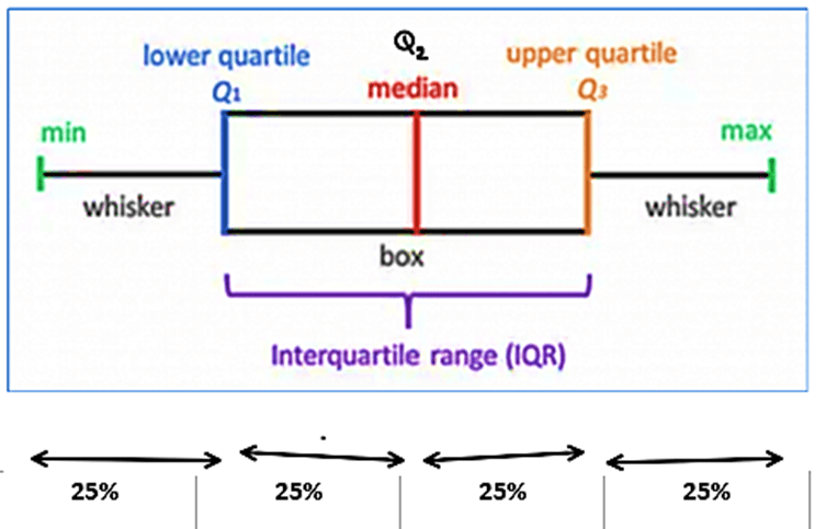
Notice how each quartile contains 25 % of the total data in the above diagram.
How to make a Box plot?
There are a total of 7 tips to complete box plots correctly. These tips were created by our experts who have over 30 years of experience. Read the given points carefully to understand box plots completely
- If input measures are represented as X factors and outputs as Y, then box plots are used when X is attribute data and Y factors are continuous data.
- A box plot is a type of chart that is normally used for observation of relationships between two different variables, one is an attribute, and one is a variable, as well as to visually display the relationship between those variables.
- The values of the variables in the box plot diagram are represented by small size box and the positioning of the box and whiskers on the vertical axis is used to determine the value of the respective data point, hence box plots use the Cartesian coordinates system to display the values of those variables in a data set.
- Since the box plot is made of box and whiskers it is sometimes called a box and whiskers plot.
- The study of such a graphical representation involving two variables and using such a diagram is known as a box plot diagram. Box plots are also known as box diagrams, box graphs, box charts and correlation charts.
- There are some common challenges that arise with the use of box plot diagrams, like the interpretation of causation as correlation and over-plotting.
- The most important thing to remember in correlation is that it doesn’t mean that the changes observed in one X variable are responsible for the changes observed in another X variable.
Features of box plot
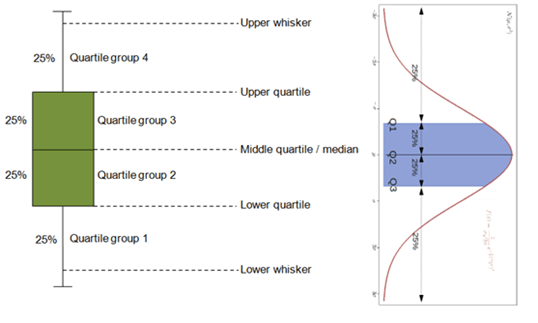
Following are the features of the boxplot that are helpful for studying the correlation between X factors and Y factors that is input and output. It has a median, whiskers, outliers, 1st 2nd 3rd and 4th quartile and interquartile range (IQR) like normal distributions. The following diagram shows the similarities between the box plot and the bell curve. The relationship between the box plot and normal distribution curve is described in the diagram below, where each boxplot and normal distribution curve are kept side by side as you can see here the highlighted area in blue shows the interquartile range between Q1 and Q3 which forms the box in the box plot as shown in the diagram.
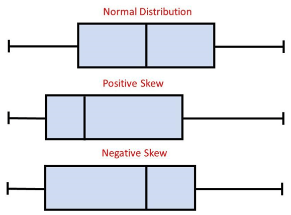
Box plots are also skewed
The boxplot is often skewed the skewness can be seen by the non-uniform distribution of data over the median of the line. When the data is biassed towards either side of the median, we can say that the box plot is skewed. The below diagram is showing skewness of data with respect to data.
Box and Whisker Plot
A box and whisker plot, also known as a box plot Six Sigma, is a powerful graphical tool used to display the distribution and variability of a dataset. This plot provides a clear visualization of the quartiles, median, and any outliers present in the data. The plot consists of a rectangular box, which represents the interquartile range (IQR) and spans the middle 50% of the data. Inside the box, a line denotes the median. The whiskers extend from the box, indicating the minimum and maximum values within a certain range. Interpreting Box and whisker plots, these are valuable in summarizing data and identifying patterns, making them an essential tool in statistical analysis and data exploration.
Box Plot in Minitab
With Minitab’s intuitive interface, users can be creating box plots by simply inputting their data and selecting the desired options. Minitab allows for customization, enabling users to modify the appearance and labelling of the plot according to their preferences. The generated Minitab box plot provides valuable insights into the data, including the median, quartiles, and any outliers present. It aids in identifying potential data discrepancies, comparing multiple datasets, and gaining a deeper understanding of the data’s distribution. With Minitab’s robust functionality and comprehensive statistical analysis capabilities, researchers, analysts, and data professionals can effectively utilize box plots to uncover patterns, make informed decisions, and communicate findings.
Box plot examples:
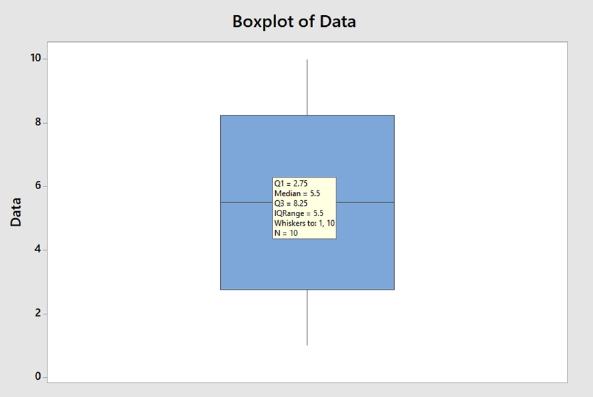
Let us take a simple example of numbers 1 to 10.
For example, 1, 2, 3, 4, 5, 6, 7, 8, 9, 10.
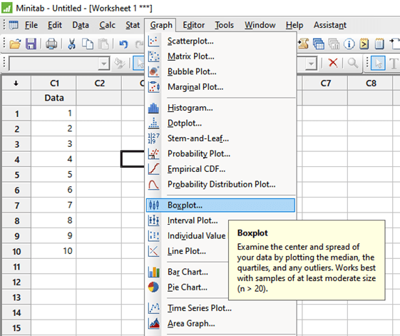
The median of data will be (5+6)/2 = 5.5 as there are even terms. Plotting the box plot in MINITAB. Go to Graph > Box Plot > Simple > OK > select “C1” > ok.
We will get the following box plot with the data given below:
Q1 = 2.75, Q2=5.5, Q3=8.25, Q4=10
IQR = Q3-Q1 = 8.25-2.75 = 5.5
Whiskers = 1, 10
Median = 5.5 (notice the median is nothing but the Q2)
Example Exercise1: We use a box plot when Input is ___ and output is ___ data
- Attribute, continuous.
- continuous, continuous.
- continuous, Attribute.
- Attribute, Attribute.
Answer: Option 1
Example Exercise2: Inter quartile range is the difference between which two parameters?
- 1st quartile and 2nd quartile
- 1st quartile and 3rd quartile
- 2nd quartile and 3rd quartile
- 1st quartile and 4th quartile
Answer: Inter quartile range is the difference between 1st quartile and 3rd quartile.
Example Exercise3: Which of the following statement is correct:
- Median of the data is the same as Q2.
- Outliers are represented by the Asterisk mark (also called “astronomical point”)
- Box plots can be used to correlate between two continuous data.
- a and b
- b and c
- c and a
- a, b, c all correct.
Answer: Option 1
Conclusion
The Box plot in Lean Six Sigma Green Belt Certification is one of the important statistical improvement techniques that we use in Lean Six Sigma projects. It is a tool that can establish a correlation between Continuous data and attribute data. (for box plot example; coming late/not late to the office and the speed of the car). Box plot gives insight into statistical data like median, Quartiles, Interquartile range, etc. Box plots can be plotted in MINITAB box plots also with a few easy steps.
Also read: Lean Six Sigma- 8 Wastes in a lean manufacturing process